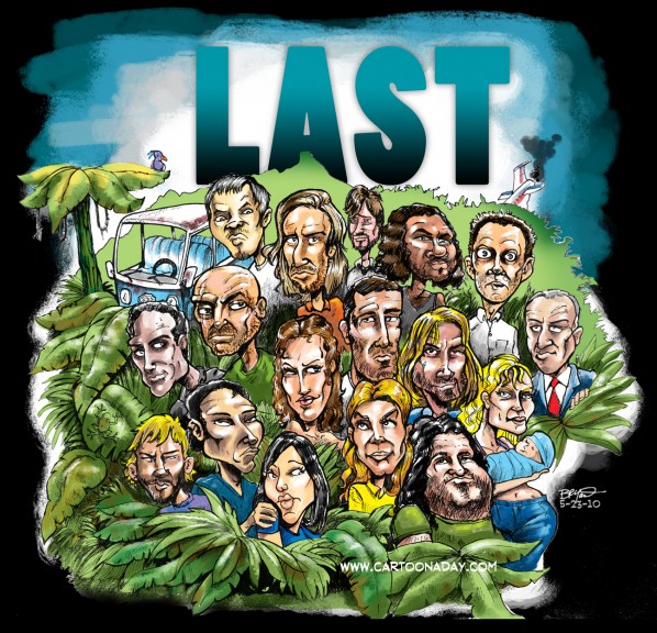
LAST LOST Airs tonight
Yep, another sketch gone horribly wrong hahahahah! What happened was I pulled out the sketchbook and doodled some of the cast of LOST as I often do, and soon they were all adding up on the page. A little composition and some hole-filling later, and I find myself with a decent pencil illustration / caricature of the cast of LOST.
Here’s the steps so you too can create a mediocre lost caricature parody of tv’s popular LOST.
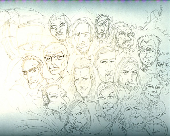
STEP 1: SKETCH
As simple as it sounds, everyone can sketch. I quickly scanned my sketchbook. The paper is larger than my scanner so I spliced 2 parts and the color is whack from there being 1/8″ distance between the flatbed and the binding. So no, I didn’t add any fancy photoshop filters to jazz up a crappy pencil sketch. At this point I had to make a decision: Will this be a (mostly) digital illustration of LOST? If it were, I could put down the pencil now, and pick up one of several wacom tablet systems I have laying around. I can choose to use Painter or Photoshop to draw with a digitizing pen on either a tablet or pressure-sensitive-color-screen. For those of you who may care, here’s a link to the Cintiq that I use most frequently.
So anyway, I decide I need more facetime with traditional tools. I decide I’m going back to pen and paper on this one. I’ve done these lost caricatures from memory (not a real good idea) so I’ll head into the internet for HULU where I can stop the characters where I want them for photo reference.
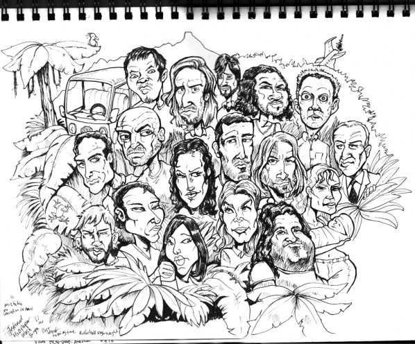
STEP 2: INKING
I don’t bother fleshing out the pencil any further since I know my own mind. If I knew I’d be here with a pen in my hand, chances are I’d have drawn only bubbles for heads in pencil. I like to straight-ink more often than not. Straight inking (no pencil sketch underneath) for me at least- has an entirely different look and feel to the finished product. It’s also faster if you’re a PAID illustrator and no one can tell the difference. But many Creative Directors demand that you send them pencil sketches prior to inking so they can make compositional changes. Often text or headlines or world balloons need to be placed over the image.
My pen of choice this time around, oddly enough, is a Mont Blanc Black rollerball ink pen. The kind your Grandparents might give you for a graduation present. It produces an ordinary, straight, black, but smoothly consistent line. I’d prefer to use a crowquill dip or fountain pen or even a brush. But in this case I was in Starbucks at the time and this particular sketchpad paper is too fibrous to smoothly hold a crowquill pen. Needless to say (maybe?) I had to revert to my junior high school days of simulating a crowquill dip pen by overworking the lines. (When I was very young, I loved the line variation the masters Like Tom Richmond and Dick Giordano and the likes could produce, but I didn’t know how they did it).
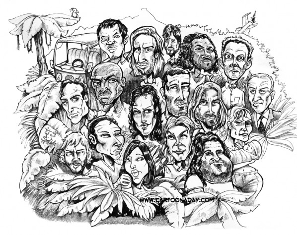
STEP 3: SHADING
Ok, so now I have a decently inked pencil illustration of the cast of Lost. I scanned it in this form and looked at it in photoshop. It was OK, but it lacked dimension. I suppose I could blame that on a standard ink pen, but won’t. It was missing texture. The sketchpad I’m using has a real nice tooth to it, but it’s absent in the inked version. So now what? I grab the PENCIL AGAIN. This time it’s my trusty lead holder with 6B lead (super soft). Now I begin to gently shade areas that would indicate shadow. Recessed eye sockets, under the nose and chin, etc etc. I see that if I control my pencil pressure, I get the grainy paper feeling I’m after. This only took a few minutes but I realize I could have easily created a new brush in Painter or Photoshop with some FAKE GRAIN and done the exact same thing. But heck, it’s already done, right?
This is a scan of the inked image, now rendered with 6B soft lead for grainy shadows.
STEP 4: COLOR
I’ve already started writing, so I won’t stop now. Don’t bother reading on unless you’re an Illustrator who’s familiar with Photoshop since it’s a bit technical. And if you are an Illustrator, chances are you know this stuff anyhow. But here’s how I do it quickly. The coloring process on this Lost sketch took about 30 minutes. Writing this post took me 45 minutes (for example).
THE FIRST THING I DO is make the lineart a new layer instead of canvas. This allows me to magic wand or erase the white areas I want to paint UNDER. Presto, now I have a floating layer. In this LAST LOST cartoon I want to create a parody of the LOST LOGO, writing instead “LAST”. With the TYPE TOOL I type out LAST in a random sanserif font that looks remotely like the LOST LOGO. Now select the Type LAYER >RIGHTCLICK> RASTERIZE LAYER. Now the TYPE is artwork. CMD CLICK>LAYER to select it. Now the selection (dancing ants) are sunning around the actively selected “LAST”. Pick a foreground color and a background color you like, then use the GRADIENT too. It hides in the palette underneath the PAINT BUCKET. Drag the GRADIENT TOOL and Bingo was his nameo. To simulate the logo which is currently appearing on HULU, I added a LAYER STYLE (little fx at the bottom of the layer palette) of OUTER GLOW>BLACK.
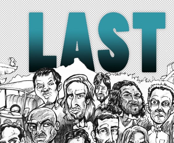
Next up is a quick NEW LAYER>MULTIPLY. Stick this new layer UNDER all the other layers and grab a big fat brush of any kind and begin painting. Again, I’m using the HULU image for reference. It’s a forebodingly dark sky overhead.
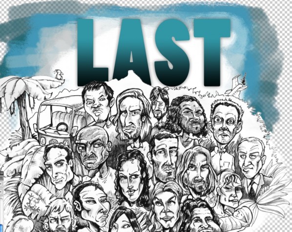
Now the fun part…coloring the FACES.
NEW LAYER> set to MULTIPLY. I find a standard ROUND BRUSH, OPACITY>set to PEN PRESSURE. THe harder you press, the darker it gets. I start with really light pressure (think of it as a light watercolor wash) of flesh tones. I do this – in this case- because there is a range of human enthicity and skin colors. I don’t want any to clash or blend. I see the entire image so I haven’t zoomed in for detail yet. I get a good sense of the overall color balance. Also, I can zoom way in and work on individual faces without worrying later I’ve got 2 skin tones of the exact same hue and shade next to or overlapping each other. I realized right away this LOST image would be muddled and confusing if I’m not careful with color and light balance. There’s alot going on for your eye to compete with. But since this is a personal project for no client and no particular reason, I go with my gut.
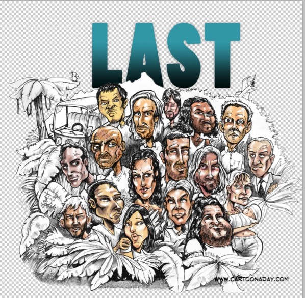
I zoom in and dial down my BRUSH SIZE a bit, getting smaller and smaller as I need more detail. The type of brush here really isn’t important yet. Any fancy brush strokes will be obliterated later by successive layers of color. I know this is simply a modified sketch so Im all about keeping it simple. I’m sticking to one layer for the Cast’s faces and clothes.
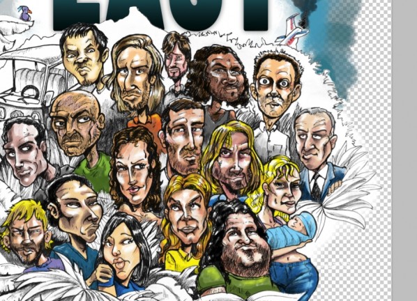
Zooming in farther, I decide to drag out a brush from my inventory with some character. You can easily make your own but that’s a different workshop. This brush is mottled like skin, and behaves alot like watercolor painting with a sponge. I zoom in again and press on.
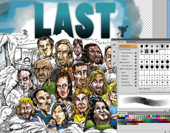
I’m finished with the LOST faces.Now for the background/foreground. NEW LAYER>MULTIPLY. I slam through this layer with a standard ROUND BRUSH, OPACITY 100%, BRUSH SIZE>Pen Pressure. I outline all the green with one big brush, and it’s all the same green. So what I’ve basically done is created a layer mask. One floating layer has nothing but 100% solid green on it in the shape of the surrounding leaves. So now it’s super easy to pick a textured brush (shown below) and go crazy with lights and darks without messing up the other layers . . . but wait, here’s the trick. There’s a tiny little BOX on your layer palette called LOCK TRANSPARENT PIXELS. Click it on. Now it’s impossible to paint anywhere else except where you’ve already put down color. In this case, green. So I can quickly alternate from light green to dark forest green to brown or yellow without having to worry about precision. It’s impossible to paint over my LOST faces or the transparent background.
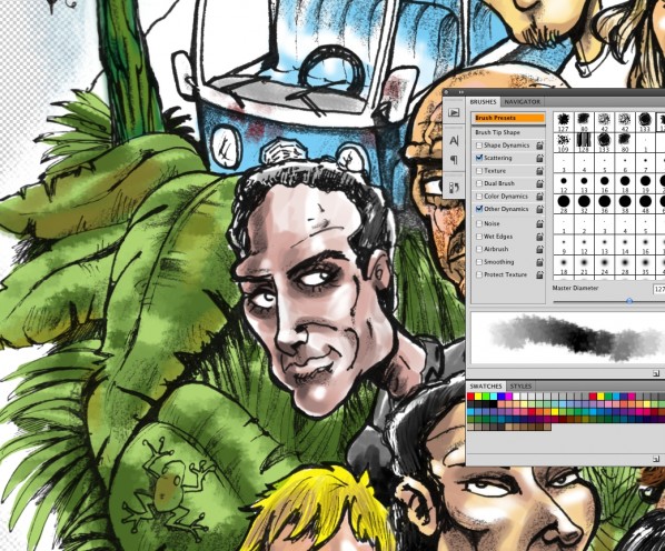
Almost done. NEW LAYER> (I call mine Hilites)NORMAL. This is the part where most traditional artists and painters reach for the white coverup or knockout paint. I don’t like relying on a top layer of 100% opacity for whites, but again, this is a super-fast sketch gone awry. The brush you see below I made a while ago to simulate scaly dragon skin. In this case, I’m using pure white to add a wet shine to the tops of some of the leaves in the background.
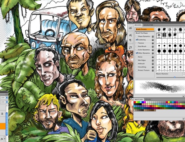
And faster than you can say, “Bob’s yer Uncle”, you’re done. At least that’s how I’VE done it. Hope you enjoyed this little romp through what is a very small and overly clutter space I call my brain. See you in the funny papers.
-Bryant

More Cartoons Like This:
- Easy Come Easy Go Easy.com Easy.go...
- Lost Jack and Kate Lost Jack and Kate Well “LOST” has only one...
- Sexy Backless Dress Another fun tutorial for the folks at Cartoonaday. If you're...
- Heartbroken Lost And Alone Cartoon Heartbroken Lost And Alone Cartoon Ever have days like...
- Last Piece of the Puzzle Sitting down for my daily toon, i scribbled an artist...


